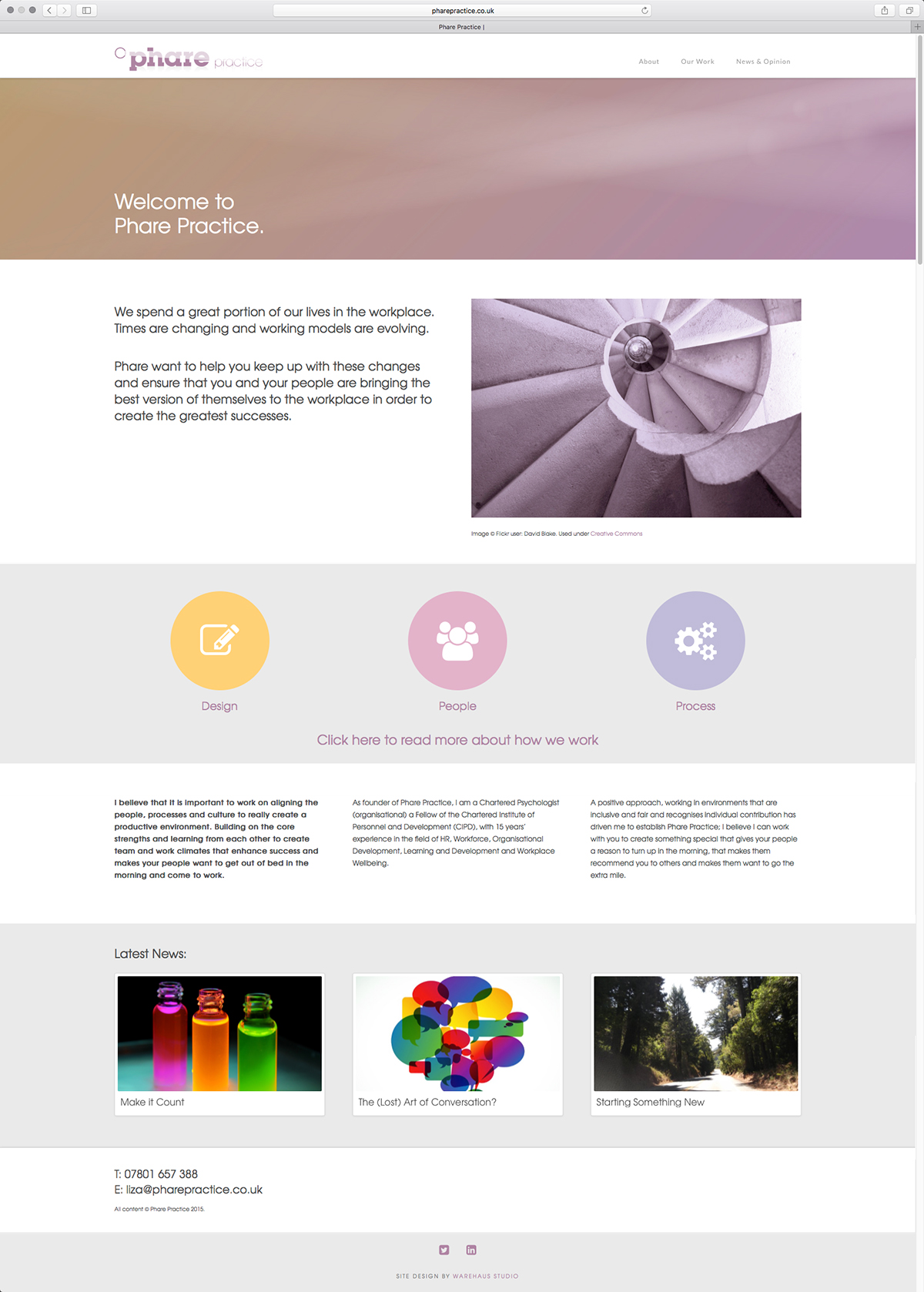
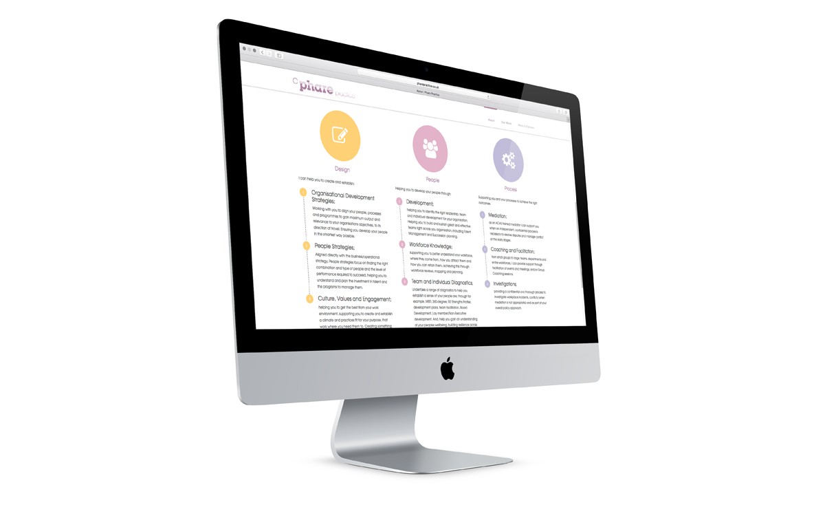
Liza Walter-Nelson is an occupational psychologist with over 15 years experience in workplace wellbeing and organisational development. She recently founded Phare Practice and asked us to work with her on creating a brand and website for her start-up business.
For now, the business is just Liza, but we felt that it was important to have an identity that was scaleable beyond just the individual; not only to cater for potential future growth, but also to enable her to work in an agile and collaborative way with other consultants or partners. It was essential that our work expressed Liza’s individual personality and way of working, but didn’t derive its meaning solely from one characterisation.
In order to find a ‘single organising principle’ for Phare, we used Joseph Campbell’s work with Jungian archetypes. According to Jung, archetypes represent fundamental human motifs and evoke deep emotions. This approach is especially useful for working with human ‘brands’, to create a more compelling and plausible story.
We felt that Phare displayed strong characteristics of ‘the sage’, with perhaps elements of ‘the magician’ to inspire and make things happen. Although Liza is an expert in her field, her way of working isn’t all about knowledge or analysis and it was important to harness a more visionary aspect within Phare’s personality.
Liza felt strongly that her work with companies and individuals should act as ‘herald’ within their story – providing the conditions for change that help to call them to their own adventure.

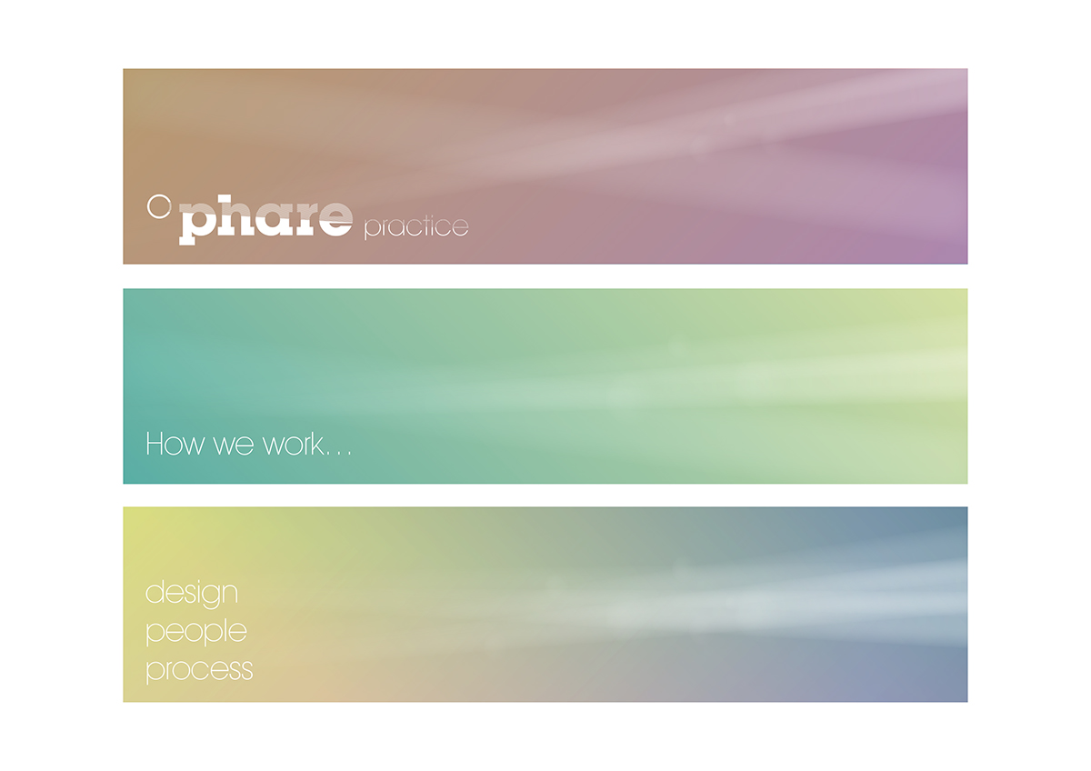
A phare is a lighthouse or beacon, used to guide ships at sea. In our early conversations about the development of the brand, we liked that the word itself was intriguing and felt it may help to promote interaction or conversation. As such, we did not want the visual brand to offer a literal explanation of the meaning; instead, we used light and shade within the typography. This allowed us to convey the ‘calling’ of the herald aspect within their personality without making heavy-handed references to lighthouses.

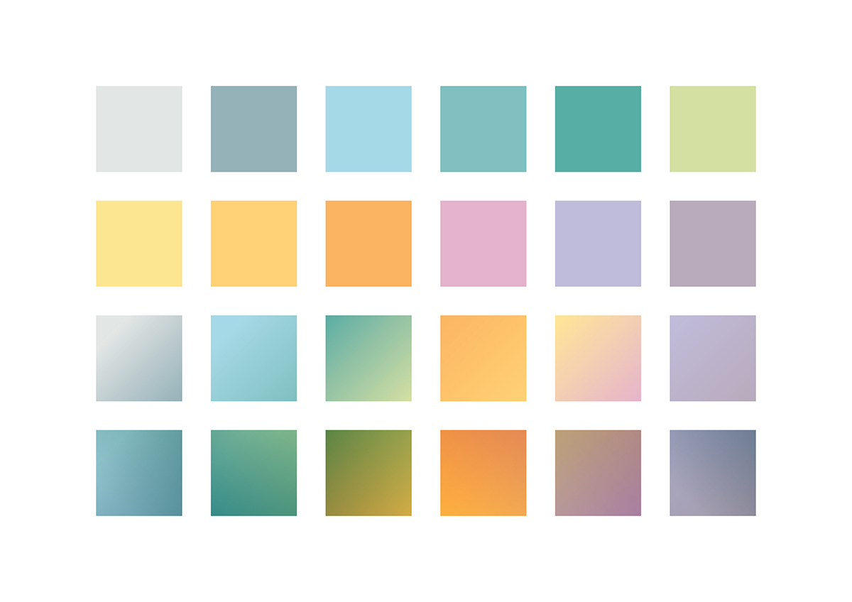
In creating the visual brand language, we needed to be respectful that their clients may prefer to maintain a certain amount of anonymity. This would have made commissioning photography difficult and stock imagery would have been too generic to communicate anything meaningful about the nature of their work. With this in mind, we created a colour palette with a wide range of tactile, warm tones; which was developed to include a range of soft gradients. Playing with light and tone in this way allowed us to create a series of visual elements that would work alongside a more abstract use of photography.


You can see the Phare Practice site here

