FLOCERT is a global certification and verification body, with the main role of independently certifying Fairtrade products. They operate in 121 countries and have regional offices on four continents.
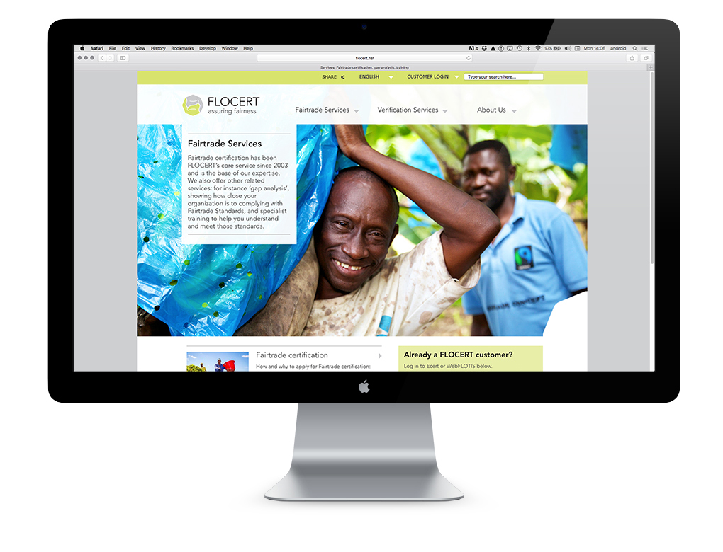
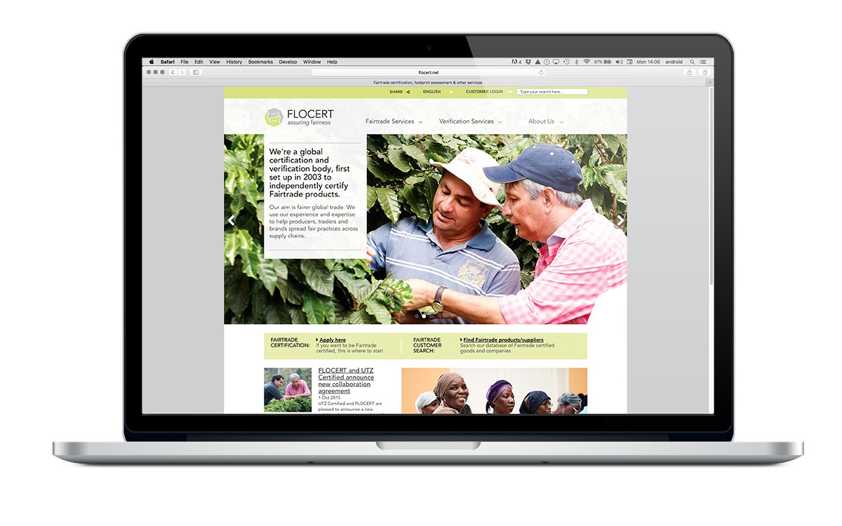
Whilst working at Neo, I was creative lead on the design and implementation of their rebrand. Working closely with the content, UX and development teams, I oversaw the design of their responsive website.
Fairtrade International are a household name, with a consumer-facing brand, although there are natural crossovers between the two organisations, there was a definite need for Flocert to talk to customers about their work in a warm and approachable manner, that added tangible value.

The brand proposals had gone through many iterations and revisions, many of which shared a ‘why’ proposition that was too close to Fairtrade to be distinguishable. It wasn’t until we’d started to think more about how they work, that we found a way of creating a brand that worked on a more emotive level.
Flocert’s vision is ‘fair global trade everyone can believe in’. The work they do is not about clipboards and compliance, it’s about forming the partnerships that help producers and traders to exchange goods and services on an equal footing. The clasped hands of the brand marque puts this expression of fairness in business at the heart of their visual identity.

It was an essential part of the brand development to communicate this sense of fairness through imagery. Photographic guidelines were created to capture natural moments of human interaction. The primary subject of the shot is always human. Product appears in the background to add context. This creates a marked point of difference from the more consumer-facing Fairtrade brand.
Preferably, the image centres on people interacting with one another; if not, then the subject looks out to camera, to engage you in the conversation as an equal. Everything is shot at eye-level. The images are of real people going about their daily life. They are never patronised or pitied – the natural sense of warmth and hopefulness is conveyed through simple human exchanges.
The art direction guidelines were used to coordinate multiple shoots, with different photographers around the world.

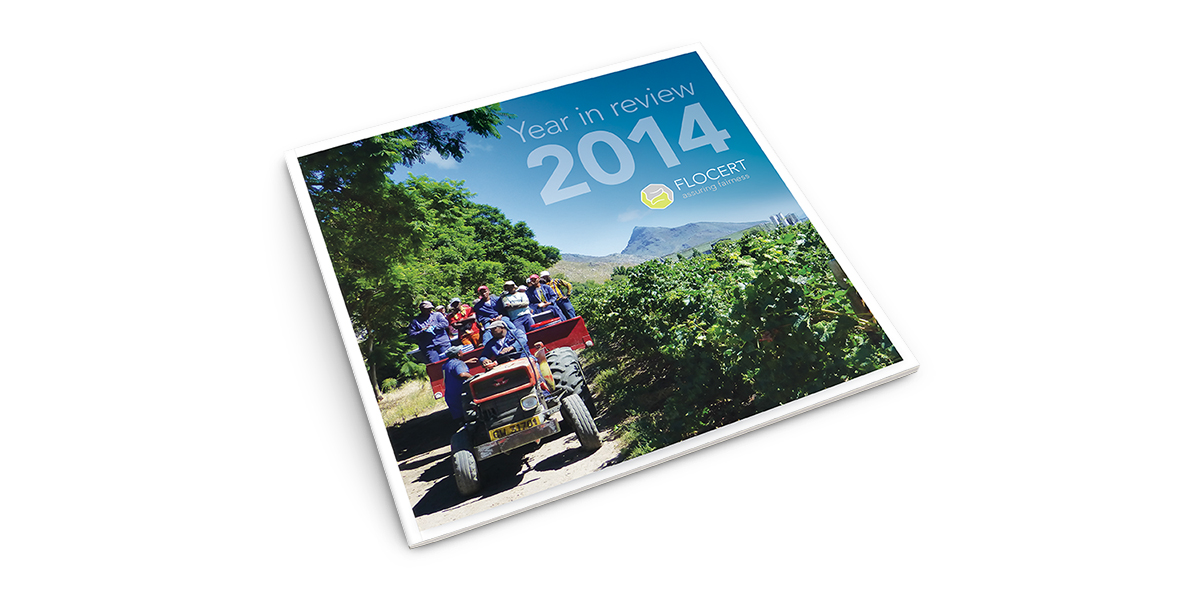
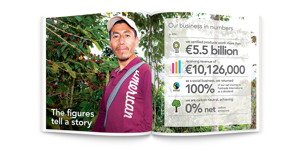
Since the launch of the brand and website, working closely with Neo we’ve continued to evolve the Flocert brand, working with them on printed materials, an expanded brand visual language, as well as developing sub-brands and brand hierarchies for products and services.
Find out more about Flocert here


