First 10 are brand and content marketing leaders offering a range of digital, brand and content marketing services. From strategic planning and workshops, content creation and motion graphics, community and digital brand experiences through to digital marketing campaigns and retained services.
We knew the founder members of First 10, having worked with them at meaningful travel provider I-to-I. Originally set-up in 2010 as a digital marketing consultancy, they have grown rapidly and expanded their service offering over the last five years.
We created their original launch brand and have since revisited this with them, to better reflect their changing team, ethic and proposition.
It was essential to communicate a hands-on warmth that differentiated them from other digital marketing agencies. The guiding premise of ‘If you can create an online brand that will fascinate, inspire and convince 10 consumers, it’s possible to scale it up and do the same thing with thousands.’ focuses on identifying and looking after a small group of customers, rather than a broad undefined blanket audience. We felt this ethos lent them the feel of a more traditional, artisan trade.
Thus, the original brand was inspired by Victorian woodcut trade signs. We looked at a more modern take on traditional heraldry, to create an emblem that denoted their specific areas of expertise and focus. The marque became a ‘blazer badge’, playing on the first XI / first XV of school sports teams, also referencing the network of ‘old school’ friends that had come together to form this new agency.
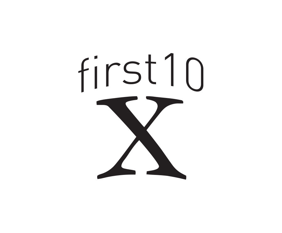
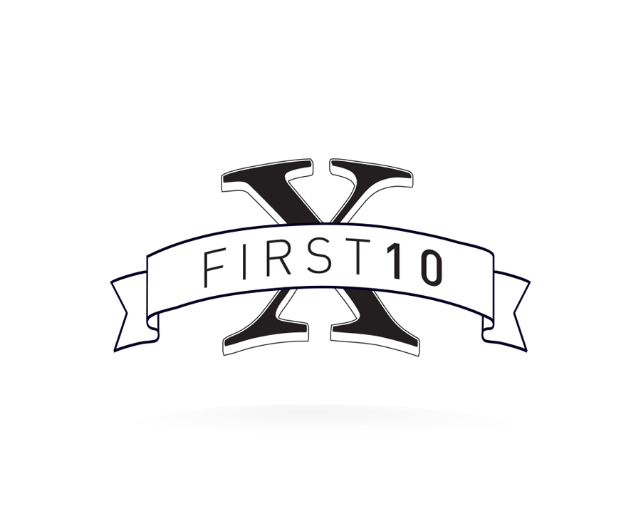
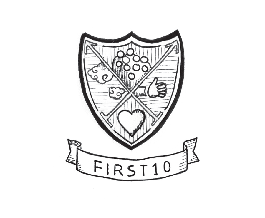
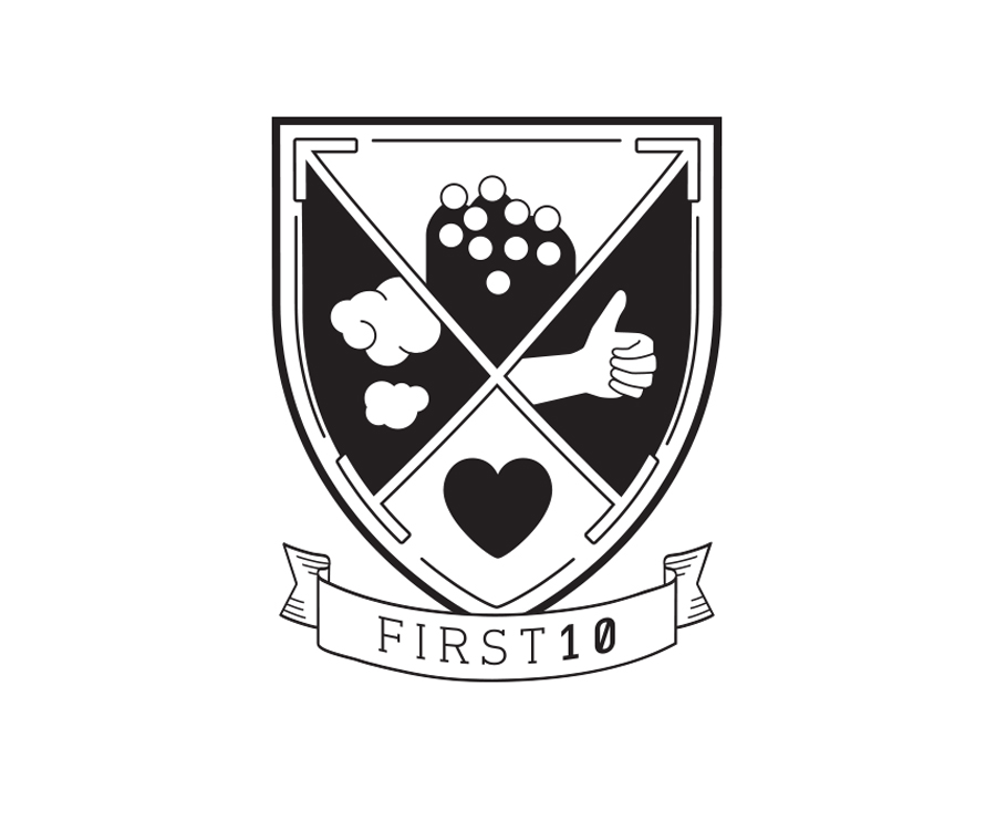
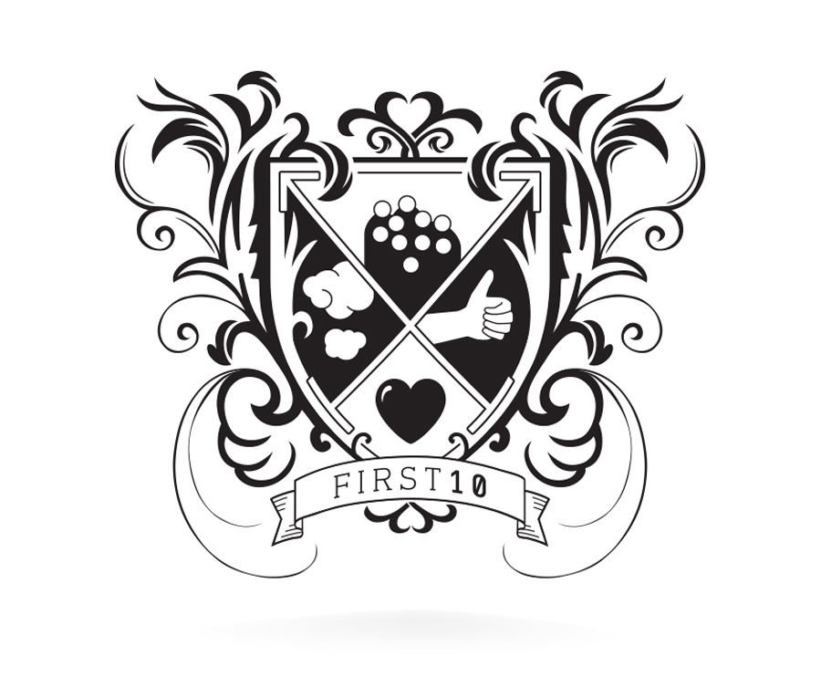
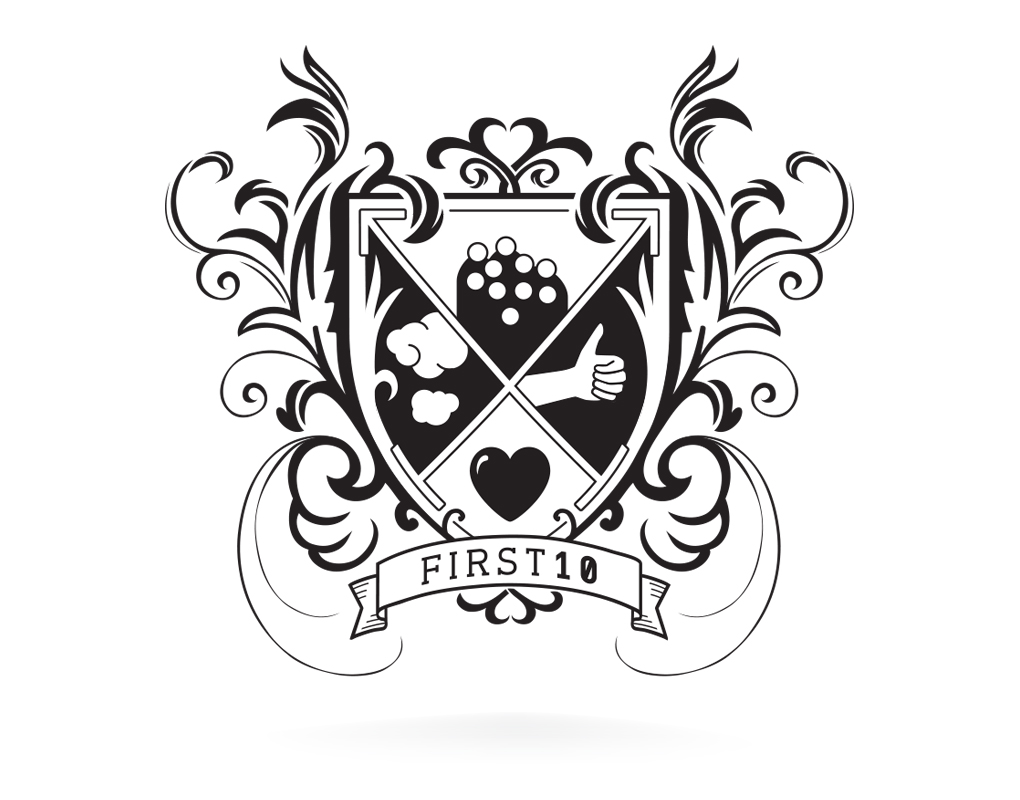
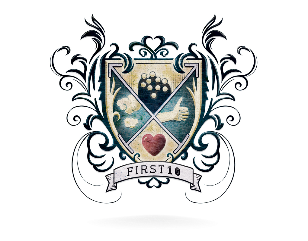
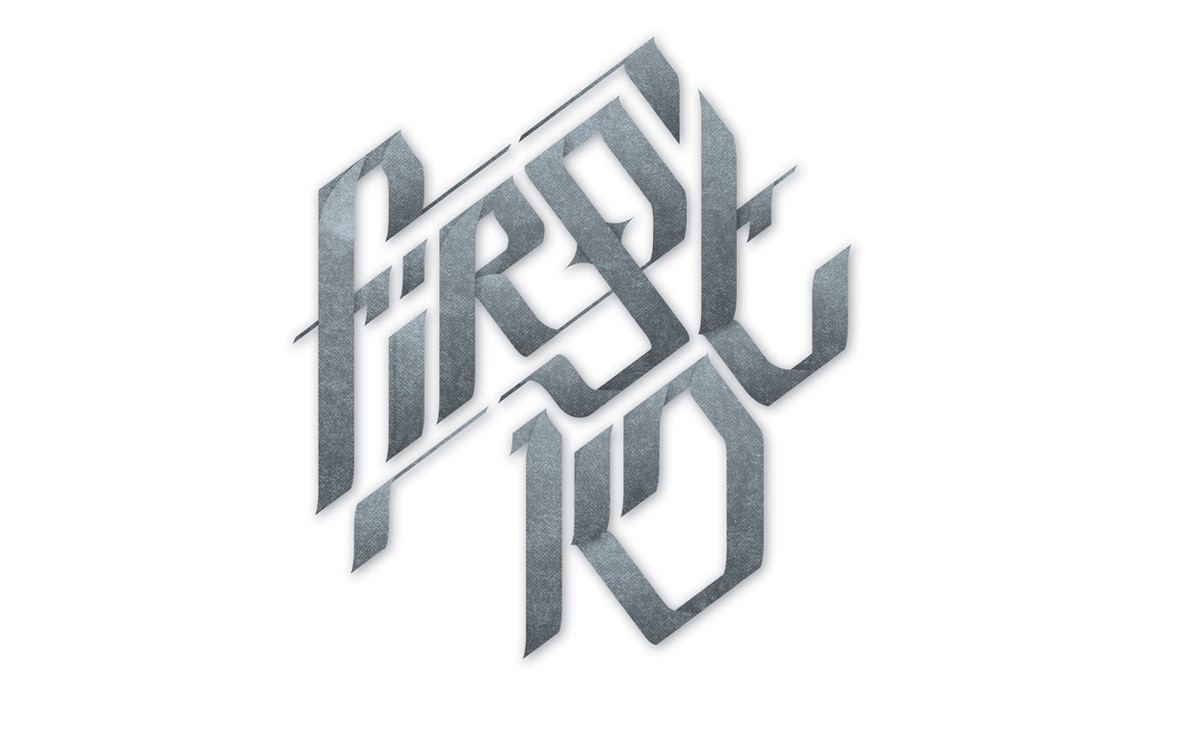
A couple of years later, we revisited the brand; originally it started as a look at separating the typography from the device, in order to introduce a latin strap-line into the scroll and make the logotype more flexible and accessible across a range of media and sizes. However, as we worked through the options, we felt that there was a strong case for creating a bespoke hand-lettered typeface, that echoed the level of craft and workmanship within the crest.
Continuing to play with a mix of traditional and modern influences, we took inspiration from the fraktur lettering of european heraldry, along with brush calligraphy and graffiti. The lettering was drawn by hand, before being cleaned up against a solid grid framework. Flourishes were then added back into the arrangement, in order to keep a hand-crafted feel.
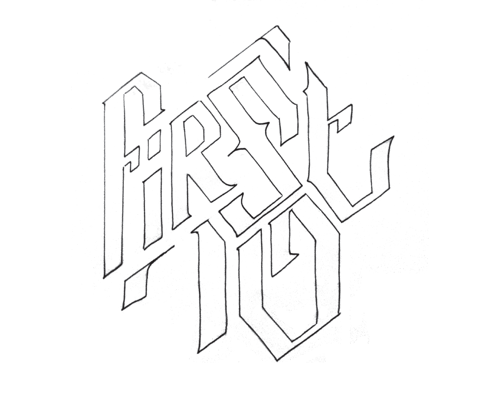
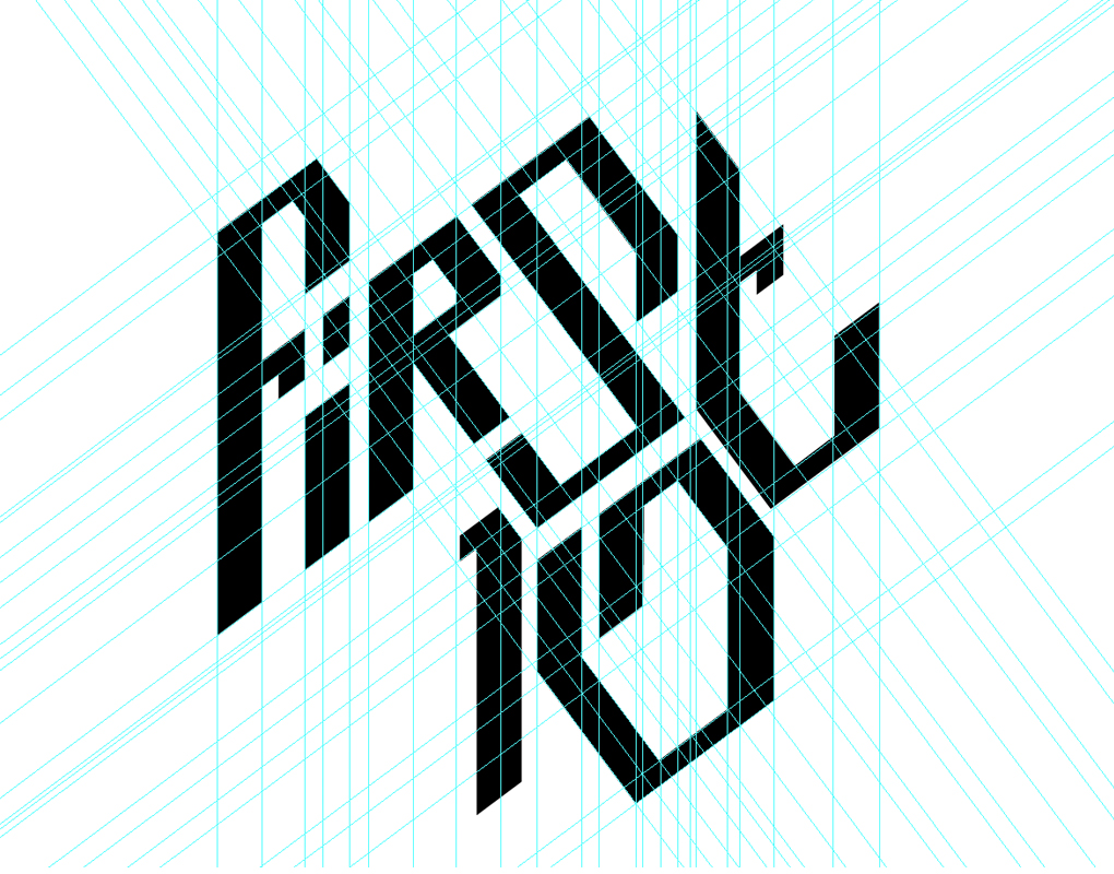
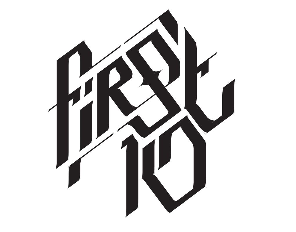
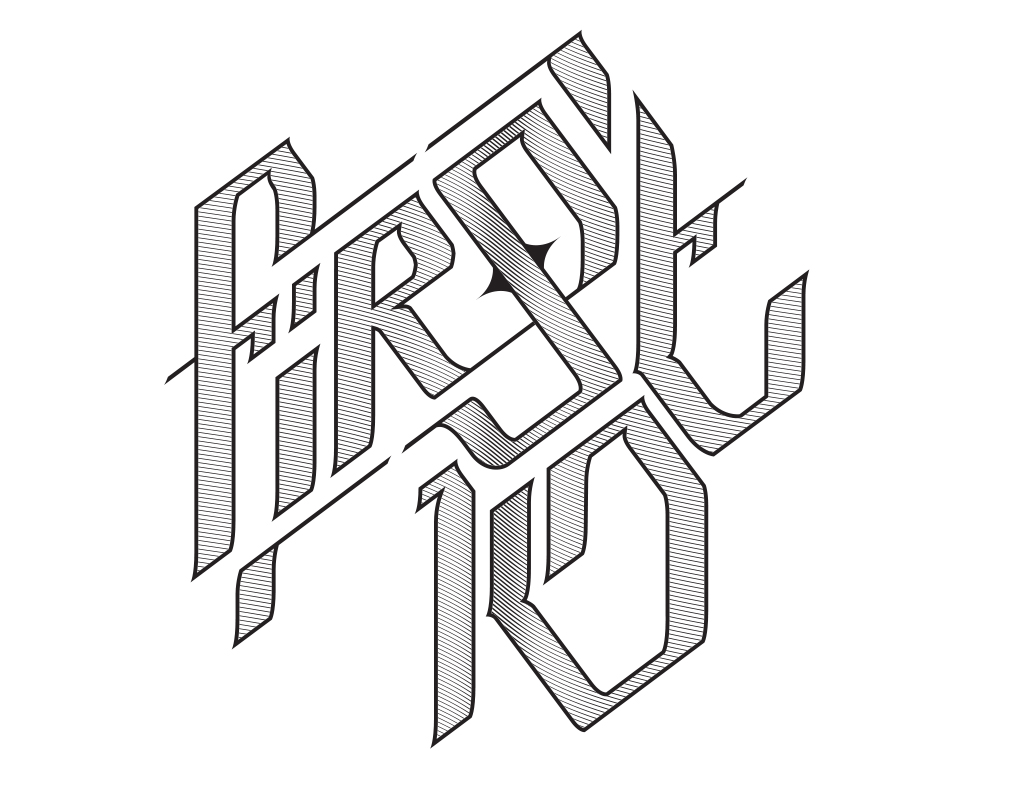
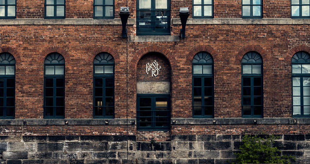
This new typographic arrangement had originally been designed to supplement the badge, but in time it has become their primary brand marque. The crest now forms part of a broader, more flexible suite of interchangeable branded assets, along with the dimensional version of the lettering shown below.
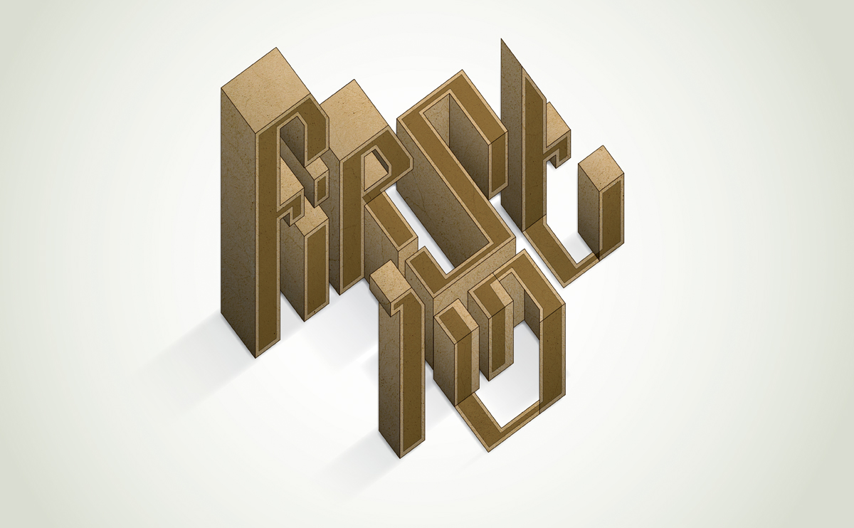
We continue to collaborate with the folks at First 10, working primarily on brand and visual identity projects, alongside their in-house design team. You can read a little more about our work together for Puma and Joey Barton in our ‘work’ section.

